In the dynamic world of e-commerce, pricing strategies play a pivotal role in driving sales and maximizing profits. Among the various techniques available, pricing curves stand out as a powerful tool for businesses aiming to fine-tune their pricing models based on market conditions and consumer behavior. But what exactly are pricing curves, and how do they work?
In this blog post, we’ll delve into the technical mechanics of pricing curves, exploring the mathematical principles behind them and their practical applications in real-world scenarios. Whether you’re a data scientist looking to optimize your company’s pricing strategy or a business owner trying to understand how to leverage data for competitive advantage, this comprehensive guide will provide you with the insights you need.
We’ll start by defining what pricing curves are and why they are essential in the modern marketplace. Next, we’ll break down the different types of pricing curves, such as linear, exponential, and logistic curves, illustrating how each functions and the specific scenarios where they are most effective. By the end of this post, you’ll not only understand the underlying mechanics of these curves but also know when and how to apply them to enhance your pricing strategy.
So, let’s dive in and unravel the intricacies of pricing curves, empowering you with the knowledge to make informed, data-driven pricing decisions.
Getting Data Ready
This post will outline quick examples of how to generate the trend line and curves we will be reviewing. The following data will be used throughout this post.
We will assume that we sold 1 product and Amazon.
| Price | Demand | COGS | Amazon Fees | FBA Fees | Profit | Profit/Unit | Trend |
| $90.00 | 35 | $1,225.00 | $481.95 | $693.00 | $750.05 | $21.43 | $750.05 |
| $95.00 | 31 | $1,085.00 | $450.59 | $647.90 | $761.52 | $24.57 | $761.52 |
| $100.00 | 29 | $1,015.00 | $443.70 | $638.00 | $803.30 | $27.70 | $803.30 |
| $105.00 | 25 | $875.00 | $401.63 | $577.50 | $770.88 | $30.84 | $770.88 |
| $110.00 | 20 | $700.00 | $336.60 | $484.00 | $679.40 | $33.97 | $679.40 |
Below is the sample data in Python format which will be used throughout this post.
landed_cost = 35
amazon_fees = 0.153
fba_fees = 0.22
sample_data = [
    {
        "price": 90,
        "demand": 35,
        "cosgs": 1225,
        "amazon_fees": 481.95,
        "fba_fees": 693,
        "profit": 750.05,
        "profit_per_units": 21.43,
    },
    {
        "price": 95,
        "demand": 31,
        "cosgs": 1085,
        "amazon_fees": 450.59,
        "fba_fees": 647.90,
        "profit": 761.52,
        "profit_per_units": 24.57,
    },
    {
        "price": 100,
        "demand": 29,
        "cosgs": 1015.00,
        "amazon_fees": 443.70,
        "fba_fees": 638.00,
        "profit": 803.30,
        "profit_per_units": 27.70,
    },
    {
        "price": 105,
        "demand": 25,
        "cosgs": 875.00,
        "amazon_fees": 401.63,
        "fba_fees": 577.50,
        "profit": 770.88,
        "profit_per_units": 30.84,
    },
    {
        "price": 110,
        "demand": 20,
        "cosgs": 700.00,
        "amazon_fees": 336.60,
        "fba_fees": 484.00,
        "profit": 679.40,
        "profit_per_units": 33.97,
    },
]
In order to use the sample code outlined below you will need to install the following python packages.
- pymannkendall
- numpy
- matplotlib
Paste the following in a Shell to install the packages.
pip install pymannkendall
pip install numpy
pip install matplotlib
Demand Trend
A demand trend chart is a visual representation that shows how the demand for a particular product or service changes over time. It’s a valuable tool for understanding patterns and making informed pricing decisions. Here’s what a typical demand trend chart might look like and the components it might contain:
- X-Axis (Price): The horizontal axis represents the price of the product. It can range from low to high, showing a variety of potential price points.
- Y-Axis (Quantity Demanded): The vertical axis represents the quantity of the product that consumers are willing to purchase at different prices. This could be measured in units sold or another relevant quantity metric.
- Demand Curve: This curve (often a downward-sloping line) represents the relationship between price and quantity demanded. It shows how the quantity demanded changes as the price changes.
The most distinctive characteristic of a standard demand curve is its downward slope from left to right, depicting an inverse relationship between price and quantity demanded – a fundamental economic principle known as the law of demand. In other words, as the price of a product rises, the quantity demanded usually falls and vice versa, assuming all other factors are held constant. However, the steepness or flatness of this curve varies depending on the product’s price elasticity of demand. A steep curve suggests a product with inelastic demand, meaning consumers’ demand is relatively insensitive to price changes. Conversely, a flatter curve implies a product with elastic demand, indicating a significant consumer response to price adjustments.
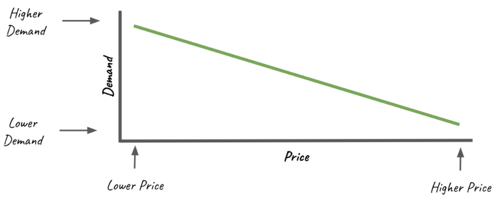
If the curve is relatively flat, signaling highly elastic demand, sellers might use small price discounts as a powerful lever to boost sales volume. Elastic demand means that consumers are very responsive or sensitive to price changes. If the price goes down just a little, the quantity demanded goes up a lot, and if the price goes up a little, the quantity demanded decreases significantly.
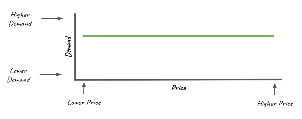
A demand curve that slopes upwards (from left to right) is highly unusual and defies the basic law of demand, which states that as prices increase, quantity demanded decreases, and vice versa. This results in a downward-sloping demand curve. However, in rare cases, certain goods may display a phenomenon known as a ‘Giffen Good’ or ‘Veblen Good’ which could result in an upward-sloping demand curve.
An upwards demand curve typically indicates that there is insufficient data or that there are measurement errors in the data. If data is collected over a too short period, or doesn’t cover a broad enough range of prices, it might capture a short-term trend that doesn’t reflect the overall relationship between price and demand.
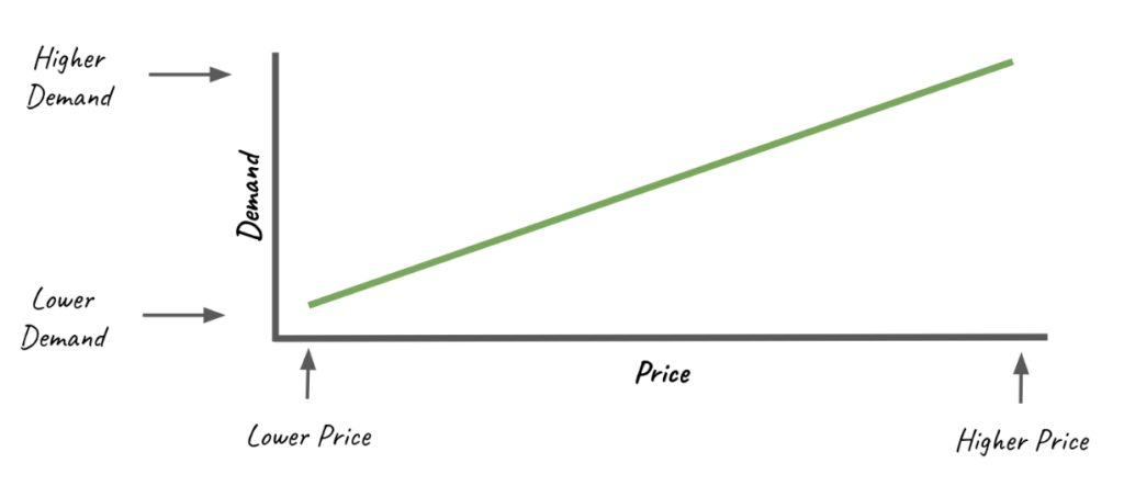
In the event that your products create an upwards demand curve, we recommend that you profile your prices for a duration of time.
How to Code a Demand Trend
Below is a sample python script that will calculates the demand trend, outputs the predicted demand for a price, and creates a visual plot.
import pymannkendall as mk
import numpy as np
import matplotlib.pyplot as plt

# Sample data from above goes here

def calculate_demand():
    demand_data = [s["demand"] for s in sample_data]

    demand_results = mk.original_test(demand_data)
    slope = demand_results.slope

    min_price = min([s["price"] for s in sample_data])
    max_price = max([s["price"] for s in sample_data])

    # get all price differences from the previous price
    price_diffs = [
        sample_data[i]["price"] - sample_data[i - 1]["price"]
        for i in range(1, len(sample_data))
    ]
    avg_diff = sum(price_diffs) / len(price_diffs)

    interval_slope = slope / avg_diff

    start_price = min_price - avg_diff
    end_price = max_price + avg_diff

    # calculate the demand for each price point based on the slope
    price_points = []
    demand_points = []

    start_demand = demand_data[0]
    for point_price in range(int(start_price), int(end_price)):
        point_demand = np.round(
            start_demand - ((min_price - point_price) * interval_slope), 2
        )
        price_points.append(point_price)
        demand_points.append(point_demand)

    return price_points, demand_points

def predict_demand(price_to_sample, price_points, demand_points):
    sample_demand = demand_points[price_points.index(price_to_sample)]
    print(f"Predicted demand for price {price_to_sample} is {sample_demand}")


def plot_demand(price_points, demand_points):
    # draw plot of the demand curve with y axis as demand and x axis as price
    plt.figure(figsize=(10, 5))
    plt.plot(
        price_points,
        demand_points,
        linestyle="-",
        color="b",
        label="Units Sold",
    )
    plt.title("Units Sold with Trend Line")
    plt.xlabel("Date")
    plt.ylabel("Units Sold")
    plt.legend()
    plt.grid(True)
    plt.show()

price_points, demand_points = calculate_demand()
predict_demand(103, price_points, demand_points)
plot_demand(price_points, demand_points)
Running the code above should product the following output:
Predicted demand for price 103 is 25.36
Profit Curve
A profit curve is a graphical representation that shows the relationship between a seller’s profit and its unit price. It is a vital tool for businesses to understand how price changes affect their overall profitability. This curve helps in identifying the optimal price point that yields maximum profit.
In a profit curve, the y-axis represents the profit, and the x-axis represents the price per unit. As prices increase from a very low point, profit generally increases because each unit sold generates more revenue. However, at some point, as prices continue to rise, fewer customers are willing to buy the product, leading to a decrease in quantity sold. Even though the price per unit is high, the reduced quantity can cause total profit to decline. Therefore, the profit curve generally takes on a concave shape, increasing and reaching a peak before eventually declining.
The peak of the profit curve represents the price point at which profit is maximized. This point is the optimal price and the one that businesses aim to identify and apply. However, finding this optimal price isn’t straightforward. It requires knowledge of the demand curve and cost structures, and it may shift as these factors change. Therefore, businesses often use pricing experiments, demand forecasting, and dynamic pricing strategies to estimate the shape of the profit curve and find the price that maximizes profit.
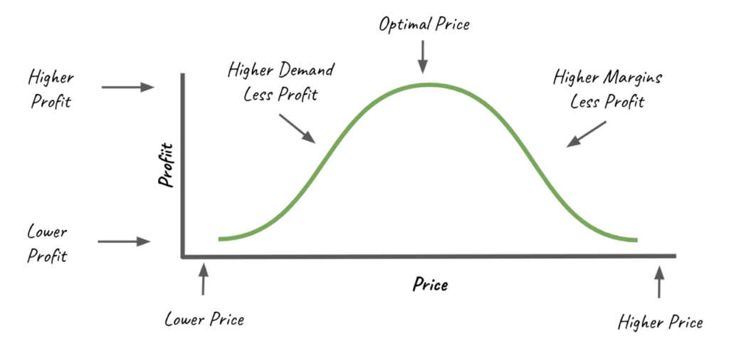
Let’s take the sample data below to generate a pricing curve. The following was calculated using:
- $35.00 Cost of Manufacturing, per unit
- 15.30% Cost for Amazon Fees, per unit
- 22.00% Fulfillment Fees, per unit
| Price | Demand | COGS | Amazon Fees | FBA Fees | Profit | Profit/Unit | Trend |
| $90.00 | 35 | $1,225.00 | $481.95 | $693.00 | $750.05 | $21.43 | $750.05 |
| $95.00 | 31 | $1,085.00 | $450.59 | $647.90 | $761.52 | $24.57 | $761.52 |
| $100.00 | 29 | $1,015.00 | $443.70 | $638.00 | $803.30 | $27.70 | $803.30 |
| $105.00 | 25 | $875.00 | $401.63 | $577.50 | $770.88 | $30.84 | $770.88 |
| $110.00 | 20 | $700.00 | $336.60 | $484.00 | $679.40 | $33.97 | $679.40 |
The price is used by the X-Axis and the Trend column is used on the Y-Axis.
The profit curve derived from the unprocessed data in the preceding table presents a rough and irregular trend, leaving us uncertain about the best price to set for maximum profitability. While the most significant profit was generated at a price point of $100, this doesn’t necessarily mean it’s the optimal price. To locate the ideal price point that maximizes our profits, it becomes crucial to refine and smooth out the data.
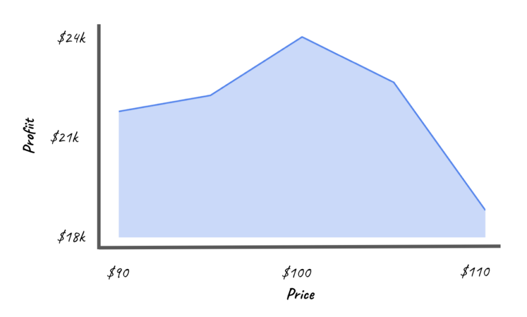
Smoothing data is an important step in the creation of a profit curve. In its raw form, data collected over time is typically erratic and can contain a lot of noise due to temporary fluctuations, anomalies, or outliers. This can make it difficult to identify the underlying trends and patterns necessary to develop effective pricing strategies.
Smoothing techniques aim to reduce this noise, resulting in a clearer, simplified view of the data that reveals the underlying trend or pattern. When applied to a pricing curve, these techniques help create a more accurate and meaningful picture of how price changes affect demand, and by extension, profitability.
Below is a representation of the same data, but smoothed to fill in missing data.
The optimal price for this product between $97.00 and $98.00
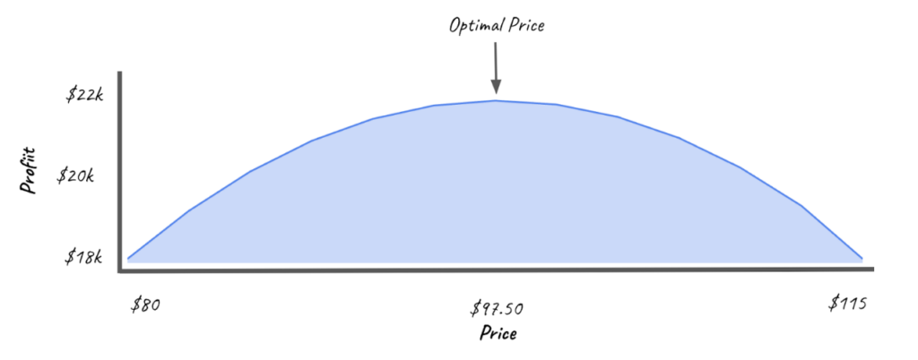
Overall, the profit curve serves as a fundamental tool for decision-making related to pricing strategy. By visualizing the relationship between price and profit, it provides critical insights to businesses on how to set prices that maximize profitability. Understanding the profit curve is particularly crucial in dynamic pricing scenarios where prices can be continuously adjusted in response to various factors, including demand changes, competitor pricing, and market trends.
How to Code a Profit Curve
Below is a sample python script that will calculates the profit curve. The outputs the predicted optimal price for the sample data, and creates a visual plot.
def calculate_profit_curve(price_points, demand_points):
    profit_points = []
    max_profit = 0
    optimial_price = 0
    for point_price in range(min(price_points), max(price_points) + 1):
        single_sale_cogs = (
            landed_cost + (point_price * amazon_fees) + (point_price * fba_fees)
        )
        demand = predict_demand(point_price, price_points, demand_points)
        profit = demand * (point_price - single_sale_cogs)
        profit_points.append(profit)

        if profit > max_profit:
            max_profit = profit
            optimial_price = point_price

    print(f"Optimal price is {optimial_price} with profit {max_profit}")
    return profit_points


def plot_profit(price_points, profit_points):
    # draw plot of the profit curve with y axis as profit and x axis as price
    plt.figure(figsize=(10, 5))
    plt.plot(
        price_points,
        profit_points,
        linestyle="-",
        color="b",
        label="Profit",
    )
    plt.title("Profit with Trend Line")
    plt.xlabel("Date")
    plt.ylabel("Profit")
    plt.legend()
    plt.grid(True)
    plt.show()

profit_points = calculate_profit_curve(price_points, demand_points)
plot_profit(price_points, profit_points)
The output of the above code should be:
Optimal price is 97 with profit 769.66439
Leveraging dynamic pricing curves is essential for optimizing profitability and staying competitive in the market. By carefully analyzing demand patterns and adjusting prices accordingly, businesses can achieve an optimal balance between maximizing revenue and maintaining customer satisfaction. Continuous refinement and data analysis are crucial to adapting to market changes and consumer behavior. It’s important to note that this analysis did not take into account external factors such as seasonality and special events, which can significantly impact pricing strategies. Utilizing these strategies will empower businesses to make informed pricing decisions that drive long-term success.